The terror of bad '90s 3D CGI design
The 1990s, like many eras, had a lot of cool designs and aesthetics.
This era* also spawned some of the most aesthetically-abominable creations ever produced by Western Civilization. (And, in my opinion, most of the Western art that garners high praise is actually really ugly, but that's another story).
With the proliferation of 3D digital design, computer graphics technologists (I'm not going to call them artists) were so preoccupied with what they could create, they didn't stop to think whether they should create these horrors in the first place.
Looking at these things (especially if you're young or were otherwise lucky enough to miss out on this phenomenon) is like stepping into an alternate reality. Who thought it was acceptable to sign off on these designs? Who could stay sane spending hours modelling all of this stuff?
* Technically this style is not only restricted to the '90s, but that seems to have been its heyday. Stuff on this page is mostly from the '80s-'00s.
The images below are included under fair use for commentary and research purposes. So, uh, don't sue us for attempting to chronicle the history of art.
Part 1 - Vintage 3D
I wasn't an internet or media addict in the '90s, so finding examples of this stuff wasn't as easy as I anticipated.
To start us off, here is an hour-long video from 1997 showcasing "classic" CGI animation from the 1980s. They range from kind of interesting, to bizarre, to "what?".
Odyssey - Computer Animation Classics (1997)
https://www.youtube.com/watch?v=R5ZTjLzm2wg
Sony Music Entertainment
Odyssey Productions Presents
Computer Animation Classics
During the 1980s, a new art form emerged that offered the imagination an unlimited palette. It is called Computer Animation. You are about to witness the amazing works that contributed to the birth of this incredible new art form.
Looking through the Internet Archive Wayback Machine, Odyssey Productions later became Animation Trip (whose website seems minimally-changed since 2003).
The organization's leader was a big fan of early 3D and produced several other collections of early 3D works.
Steven Churchill: In 1986 Steven produced the world's first CGI theatrical festival, exhibited to capacity attendances at the Museum of Contemporary Art in La Jolla, California. In 1987 Steven arranged national distribution of the festival through the Landmark Theatre chain, which also had great success. Subsequently Steven produced Future Visions, premiering at the Reuben H. Fleet OmniMax theatre, then touring thereafter at several other large format venues around the country. In 1988 Steven released the world's first computer animation video, entitled State of the Art of Computer Animation, which the American Film Institute gave their Best Video Art award that year. Since then Steven has produced 27 various computer animation compilations, released on VHS, laserdisc and DVD. In 1990 Steven produced The Mind's Eye, and followed that up with Beyond The Mind's Eye, The Gate To The Mind's Eye, and Odyssey Into The Mind's Eye, selling over 2 million units to date. Works by Pixar, PDI, Blue Sky's Chris Wedge, Digital Domain, Rhythm & Hues and just about every computer animation studio in the world have all been exhibited on these releases.
https://web.archive.org/web/20220306073411/http://www.animationtrip.com/store/features/history.php
This one is by far the creepiest from the film. Not just in the still images below, but in the entire animation itself.
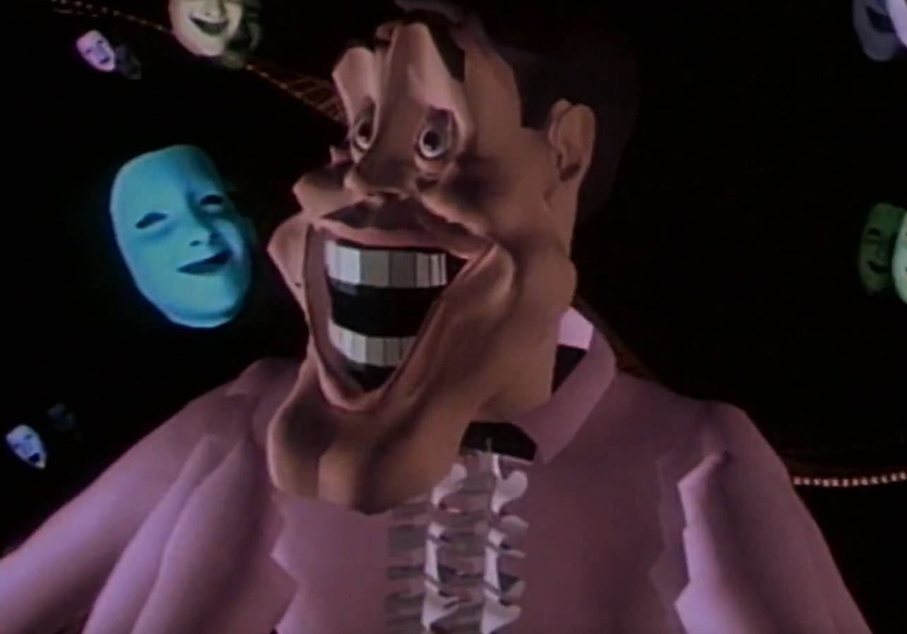
Tony de Peltrie (1985), by Taarna Studios Inc. (40:37-46:43)
It starts off creepy—yet par the course for ancient 3D animation—however, it then takes a turn into bizarro world.
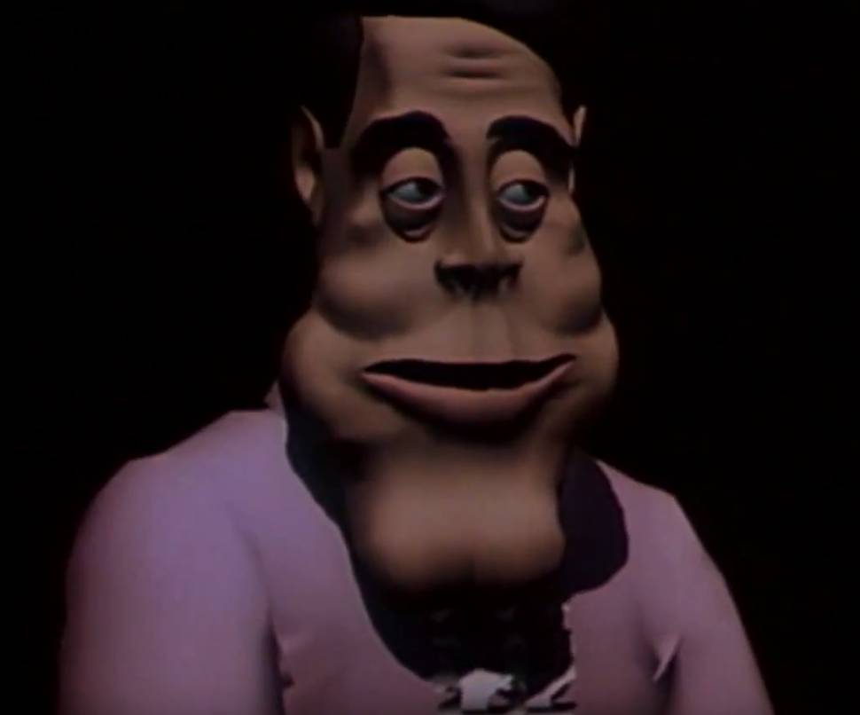
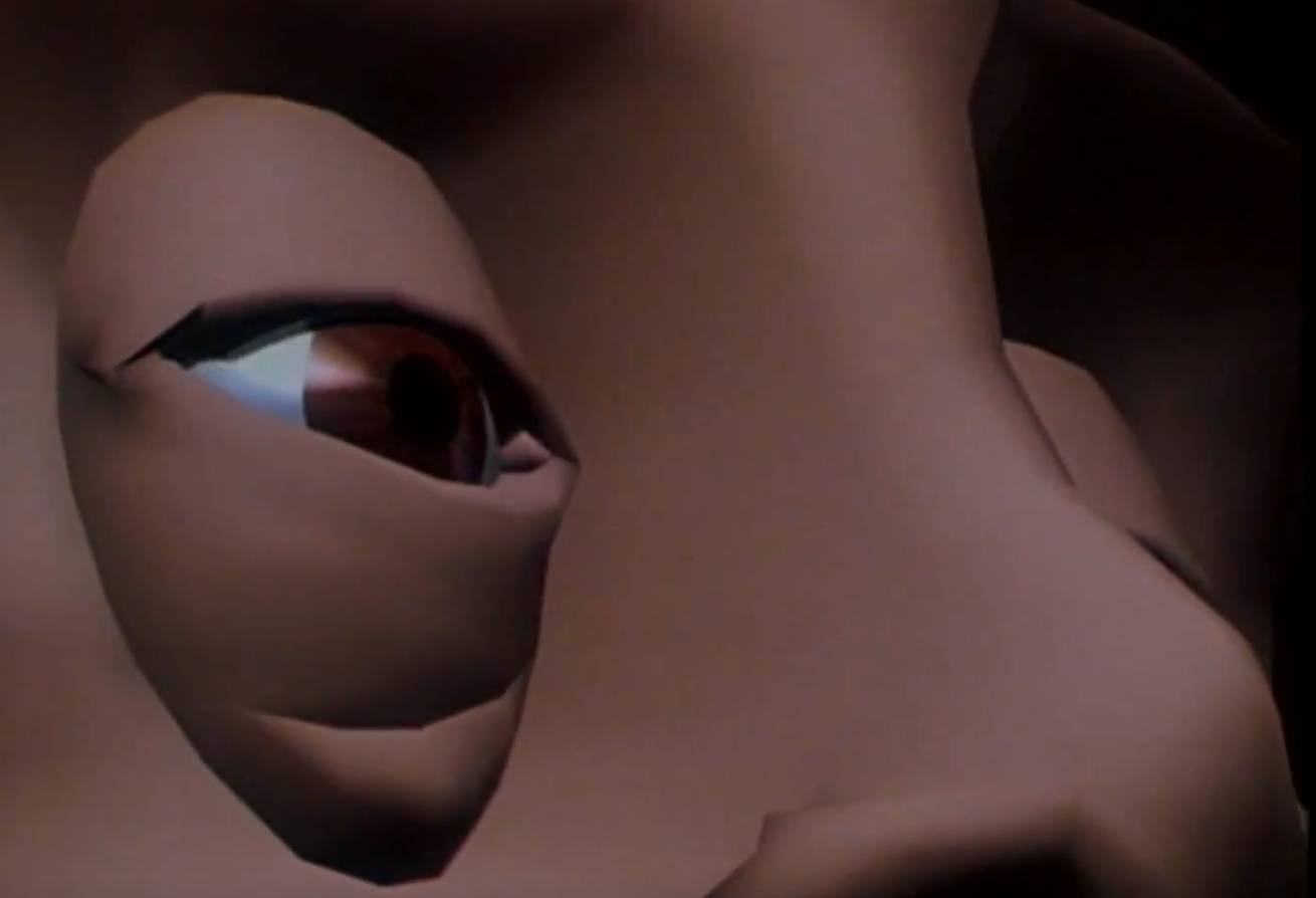
The short shows the first animated human character to express emotion through facial expressions and body movements, which touched the feelings of the audience.[1][2]
[...]
Tony is not all that life-like in appearance, but the animation is so realistic that by the end of the short, you are really feeling for him.“
...Huh, if you say so.
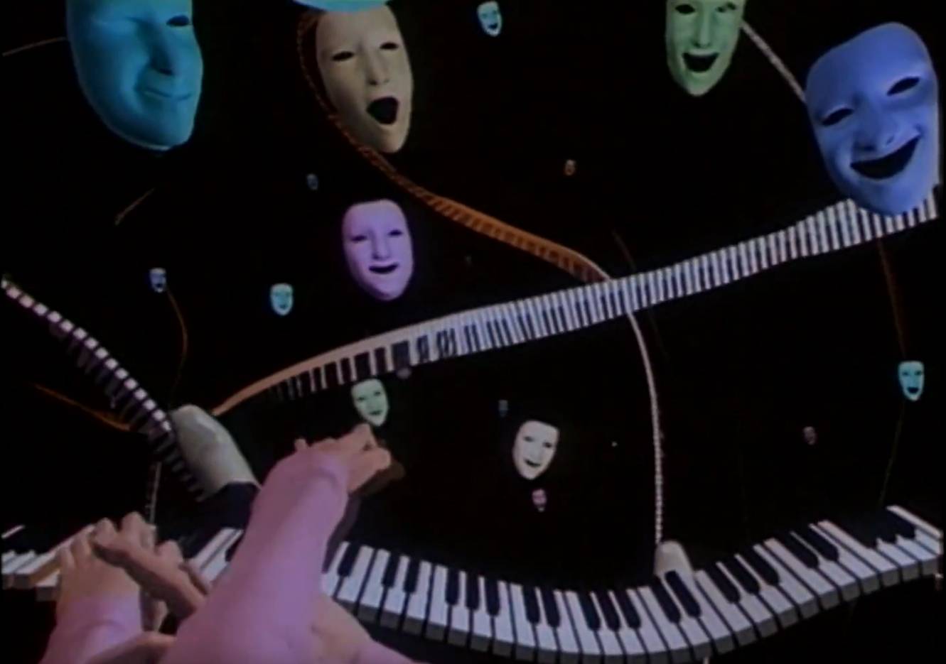
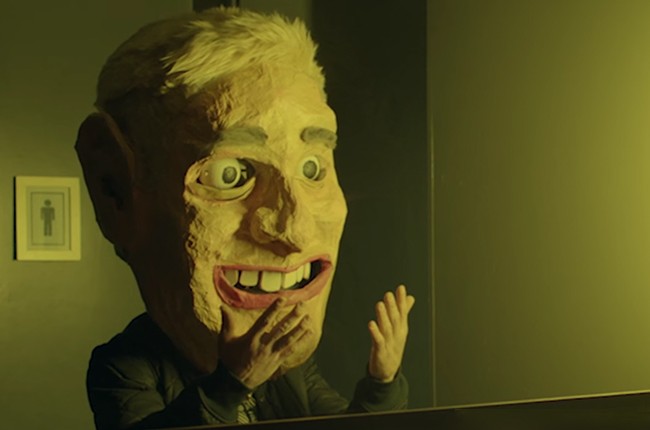
Why do all those faces look like Mark Zuckerberg if he attempted to smile?
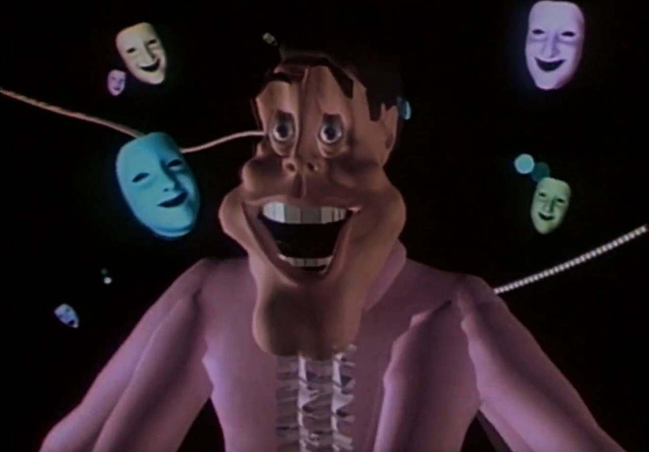
Well, it looks like at least one stylistic aspect has remained into recent times:

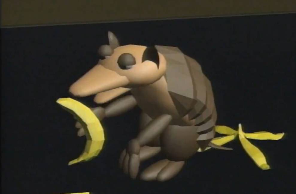
Speeder (1986), by Art Center College of Design. (28:26-29:32)
The concept of this short clip isn't so bad, but the armadillo is definitely classic early CGI.
Balloon Guy (1987), by Chris Wedge. (33:13-34:51)
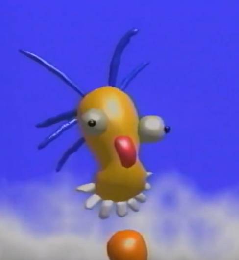
...Wait a second. What does this remind me of?
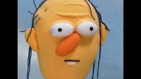
If you look through the related Youtube videos, you can find a lot of other early 3D compilation videos as well. For example:
The Pacific Arts Corp., Inc. The Art of Computer Animation (1988)
https://www.youtube.com/watch?v=MWu0vc280WY
FRESH Video Portfolio Computer Graphics Animation (1992)
https://www.youtube.com/watch?v=8zde0pdy-wI
Sony Music Video, Computer Animation Festival (1996)
https://www.youtube.com/watch?v=otqQuCD7ptQ
Check out Vision Obious (1986), by Ruedy Leeman (from 43:58-46:09 in The Art of Computer Animation). It's surreal and creepy, but you can only get the impact from watching it yourself. I warned you.
Before moving on, here are a few from the compilation videos that are downright bizarre, rather than "bad." For the sake of my sanity, I haven't gone through all of these videos in full.
From 19:28-22:18 in the State of the Art of Computer Animation (1988), the video describes the creation of the animation Brilliance (1985), by Robert Abel and associates, and plays it in its entirety.
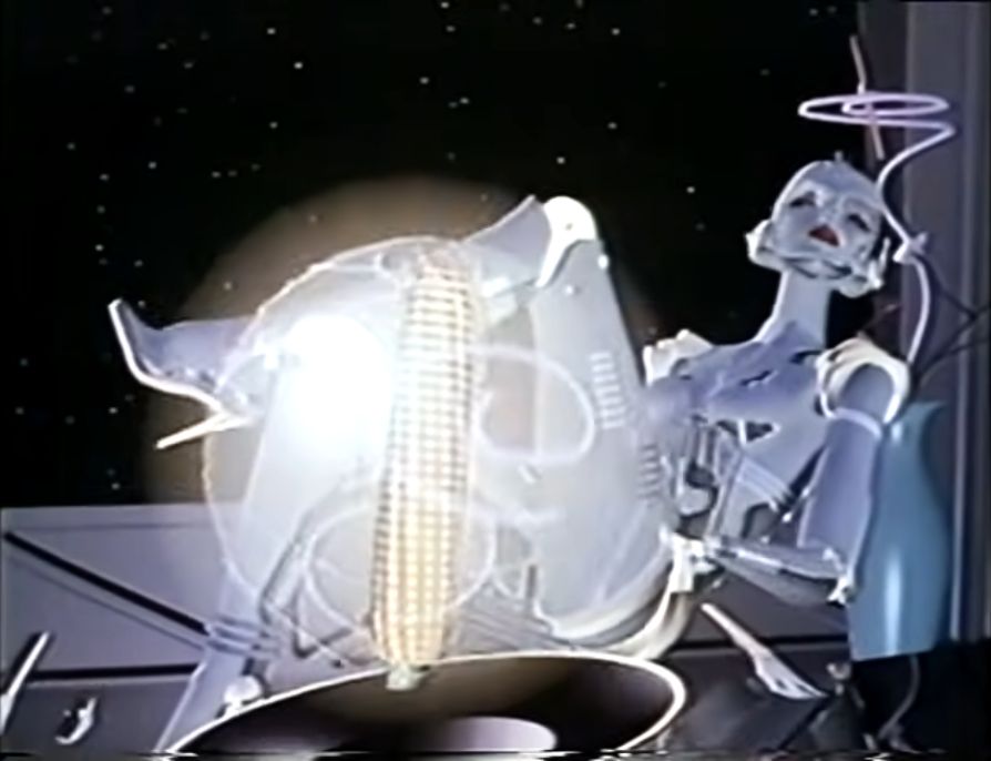
(Now we know what this famous stock image series was inspired by.)
From 44:27-50:14 in Computer Animation Festival (1996), there is a bizarre dance battle between two humanoid creatures with flowing, exposed nerves, who are debating over post-modern philosophy while summoning an occult being, before becoming self-aware that they were created by an animator.
...Yeah.
It's called The End (1995), by Alias/Wavefront.
Moving into the early 21st century, one example of this design style that retains a cult following in the 2020s are the creations from free-smiley.de and free-smiley-faces.de.

I'm not going to go full internet historian here, but apparently the website was created in 2002. By 2018, the creator had realized his folly and attempted to destroy his creation, but it was too late. Once you upload free smileys to the internet, you cannot simply undo such an action. (Some believe the site was taken down because a Youtuber brought unwanted attention to the creator, as a new generation became enthralled by the terror).
We must consciously consider each action we take, reflect upon the consequences, and ask ourselves if it is worth taking. A little introspection could have saved the world from aesthetic nightmare.


The bizarre look of the smileys has become an object of fascination by numerous internet users, and fan sites and archive attempts have sprung up.
Here are some of the archives:
https://freesmileyfacesde.neocities.org/
https://freevivedsmileys.wixsite.com/freevived-smileys-de
https://drive.google.com/open?id=1Kvp6JxmNarSrFkyua8RCLfDSz77O1NYe
https://old.reddit.com/r/freesmiley/comments/knv5ch/freesmileyfacesde_archive_working_website/
Here are just a few of the fan sites:
https://freesmileypantheon.neocities.org/
r/freesmiley, created November 5, 2017.
https://old.reddit.com/r/freesmiley/
r/FreeSmileys, created December 13, 2017.
https://old.reddit.com/r/FreeSmileys/
r/freesmileylore, created September 11, 2019.
https://old.reddit.com/r/freesmileylore/
I was first exposed to this godless terror at a thrift store many years ago. Or maybe my grandma found it on sale in the bargain bin and forgot about it for 20 years before gifting it to me.
Here are some rare images from Amazon and Ebay. These may be the only images of this thing on the entire internet, and I apologize for proliferating them.
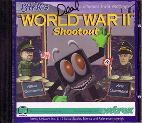
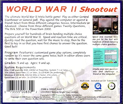
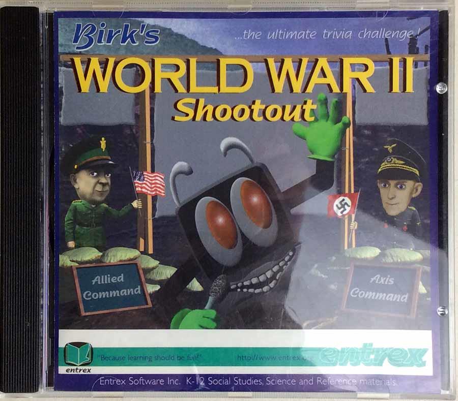
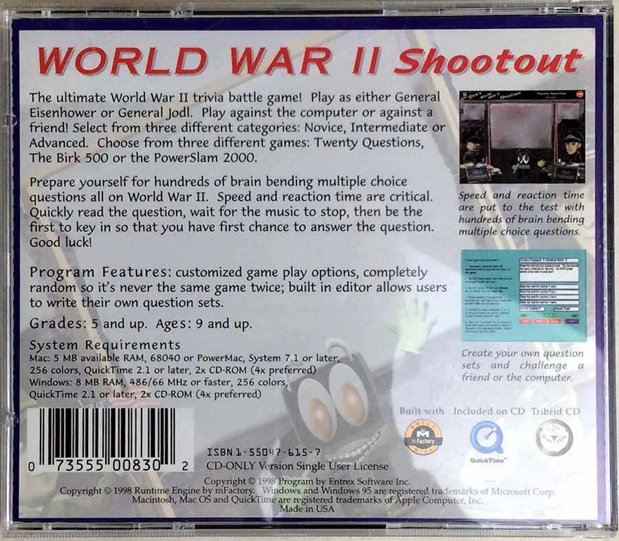
I can't find much information on the company Entrex Software Inc., or who Birk is. Is Birk the mascot? The name of some manager who signed off on plastering this this unholy creation onto the software?
This is what the website MobyGames says about the company:
Entrex Software Inc. was founded in 1982 in Victoria, British Columbia, Canada. The company developed and published educational and edutainment software for PC and Macintosh. The company's primary focus was to produce quality tools designed specifically for the classroom, and so Entrex's major customers were schools.
The company's products were distributed by major resellers including Scholastic, Forest Technologies, Learning Services, Software Express and Scantron Quality Computers.
In June 2004 the company was acquired by Black Dog Media and became a division of that company. However, Black Dog Media disappeared by mid 2005 and may have gone out of business along with Entrex.
Here is what the disk says, for any web surfers out there trying to desperately search if they are not alone in having been traumatized by Mr. Birk.
Birk's World War II Shootout
...the ultimate trivia challenge!
"Because learning should be fun!"
Entrex Software Inc. K-12 Social Studies, Science and Reference materials.
The ultimate World War II trivia battle game! Play as either General Eisenhower or General Jodl. Play against the computer or against a friend! Select from three different categories: Novice, Intermediate or Advanced. Choose from three different games: Twenty Questions, The Birk 500 or the PowerSlam 2000.
Prepare yourself for hundreds of brain bending multiple choice questions all on World War II. Speed and reaction time are critical. Quickly read the question, wait for the music to stop, then be the first to key in so that you have first chance to answer the question. Good luck!
Program Features: customized game play options, completely random so it's never the same game twice; built in editor allows users to write their own question sets.
Grades: 5 and up. Ages: 9 and up.
System Requirements
Mac: 5 MB available RAM, 68050 or PowerMac, System 7.1 or later, 256 colors, QuickTime 2.1 or later, 2x CD-ROM (4x preferred)
Windows: 8 MB RAM, 486/66 MHz or faster, 256 colors, QuickTime 2.1 or later, 2x CD-ROM (4x preferred)
ISBN 1-55047-615-7
Copyright © 1998 Program by Entrex Software Inc.
Copyright © 1998 Runtime Engine by mFactory.
Look how cute and happy Generaloberst Jodl looks. What 5th grader wouldn't want to pick him as their character?

After the war, Jodl was indicted on charges of conspiracy to commit crimes against peace, planning, initiating and waging wars of aggression, war crimes and crimes against humanity at the Allied-organised Nuremberg trials. The principal charges against him related to his signature of the criminal Commando and Commissar Orders. Found guilty on all charges, he was sentenced to death and executed in Nuremberg in 1946.
Uh oh. I guess having to stare at Mr. Birk is his eternal punishment for not being fast enough with his trivia buzzer during the Burkinator 500 PowerSlam.
To spare myself the same fate, I don't have any curiosity to play the game.
There were other Entrex games which featured this mascot from the abyss.
For example, Birk's Civil War Shootout, another horror from 1998.

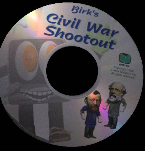
First, let's start with Grant and Lee. It looks like Entrex realized it was a mistake to make 3D models of faces and just copied photographs with weird eyes.
They both look like they're trippin' out of their minds and are about to become part of a Mike Posner music video.

And Mr. Birk... He's even worse than the WWII one! Look at the closeup of those jank teeth on the disk! Someone even spent the time giving him what I can only assume are Civil War cavalry boots? (Or maybe that is just his regular style, since they appear to be in the WWII game as well.)
Imagine being a teacher who was forced to use this "educational" software and being greeted by that creature each time you took out the disk!
Please leave me a note if you know of other examples of lost media featuring Mr. Birk. ...Or maybe it's for the best that it doesn't see the light of day again?

There is a Reddit subforum called r/CrappyDesign. It has two terror-inducing mascots.
One of them is "Dunk," who is apparently a mascot for an internal NSA initiative to encourage employees to recycle. (Or, more likely, some kind of psyop to melt our brains with bad CGI.)

...The way his face just kinda extrudes from his flat body. Lord have mercy on us.
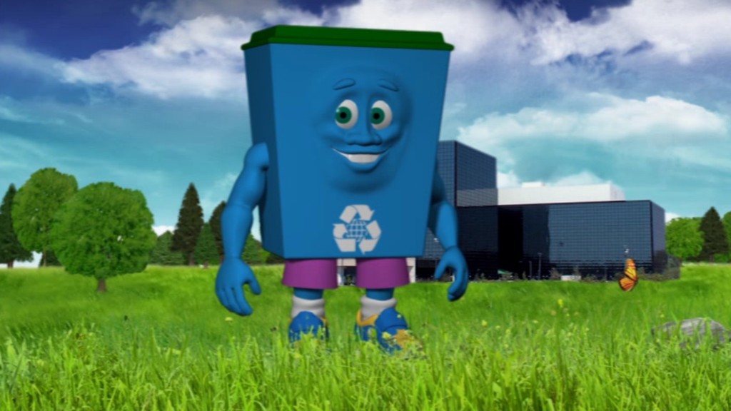
According to some Reddit threads, it was still around as recently as 2015.
https://old.reddit.com/r/CrappyDesign/comments/350krq/dunk_the_nsas_new_recycling_mascot/
I don't feel like ending up on their liquidation list, so I'll let you poke around their website and Wayback Machine links to explore it further.
The second mascot is a mattress named "Comfy" from the Comfort King Mattress Factory company in Sioux Falls, North Dakota, USA.
https://old.reddit.com/r/CrappyDesign/comments/2lbvjt/local_mattress_companys_mascot/
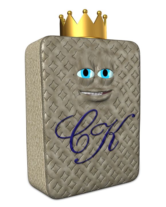
Comfort King themself posted a 1080p version of one of their advertisements featuring this demon:
https://www.youtube.com/watch?v=qB2_NTmJkl0
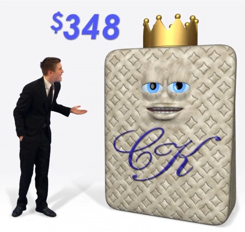
(I'd pay $348 plus taxes in order to erase all memories of that thing from my brain.)
They have a lot of their ads on their Youtube channel, including one where Comfy does standup that will put you straight to sleep, and one where he literally murders a competitor.
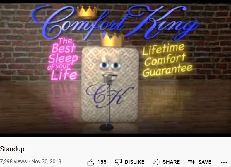
By 2020 they redesigned Comfy so he no longer looks like some kind of stoned demon made as a freshman animation project from the '90s.
Someone in the Reddit comments mentioned a 1990s Australian mattress mascot called "Mr. Yawn" which is even more terrifying (although it's not CGI). Instead, they made a full-sized costume of it, and it's too disturbing to post an image directly on this page.
Why are mattress companies like this?
I wonder if Jay Jay the Jet Plane (1998-2005) traumatized all the children who had the misfortune watching it? It certainly traumatizes me as an adult.
If you've never heard of it before, it seems like it was a low-budget Thomas the Tank Engine ripoff. It was likely one of the earliest of the kinds of low-effort 3D cartoons for kids that are so common now. The animation is so bad that you'll have to look it up on Youtube to believe it. Even early 2000s GMod meme videos have better animation. (Seriously!)
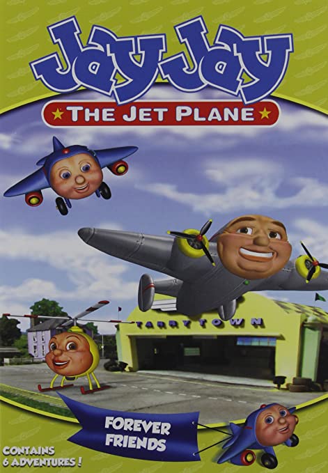
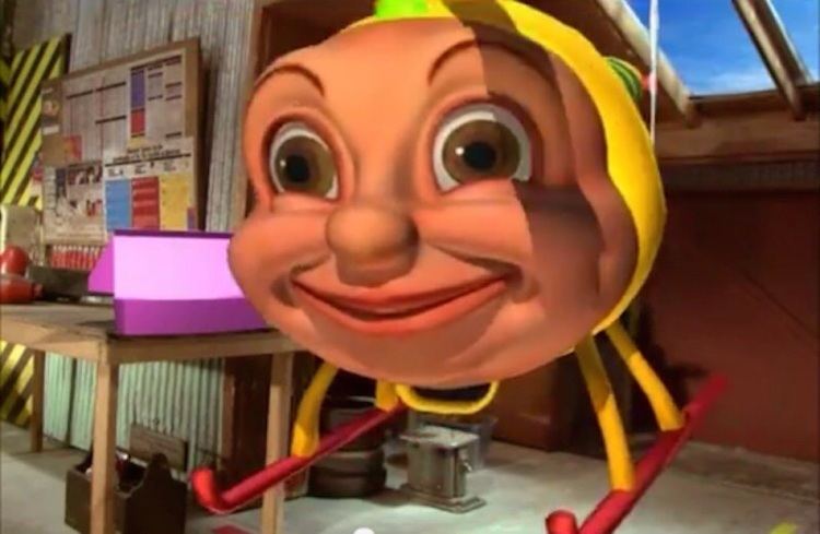
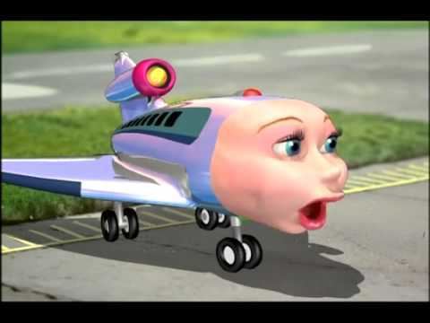
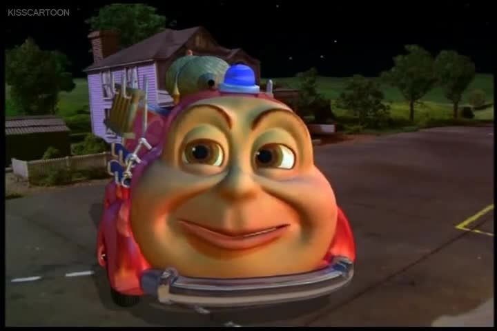
And it gets worse!
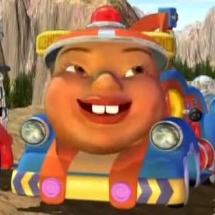
What the hell! Yeah, that orange thing is a conical hat too.
Apparently this not-at-all racist character is part of God's plan.
I bet you could have lived quite contently without ever learning about Baku Baku Animal (1995).
The design on the cover is more intentionally horrifying rather than just poorly-crafted, I think. However, within the game itself, the characters are a great example of the bad CGI aesthetic.
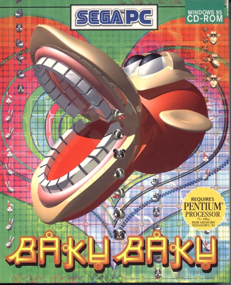
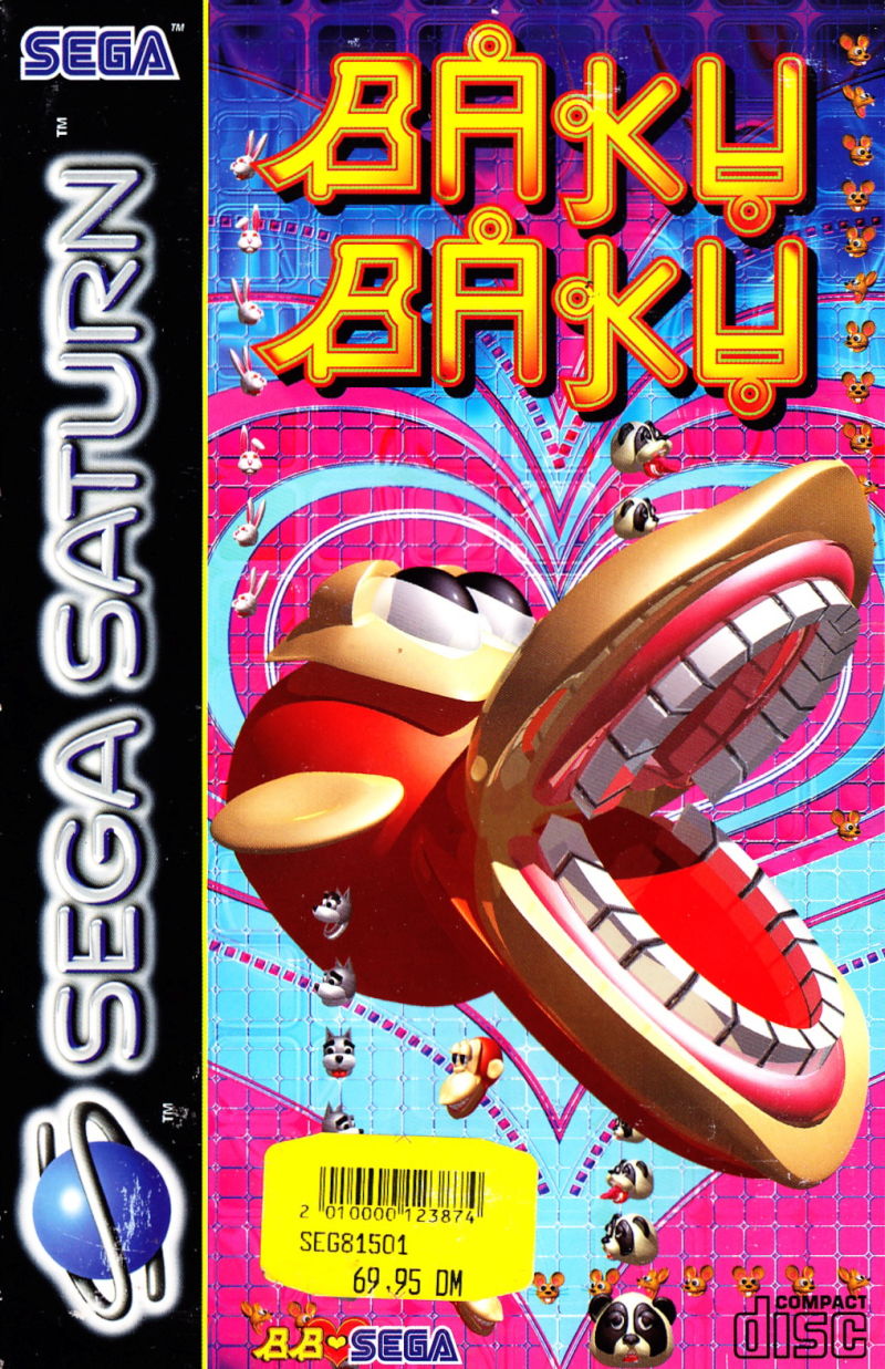
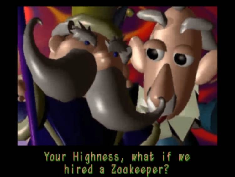
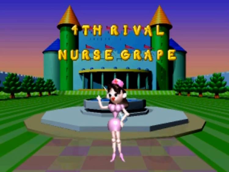
The game itself is a falling-blocks puzzle game. For spending so much time modelling the monkey, its appearance on screen is very small compared to everything else.
You can watch a terror-inducing playthrough of the game here:
https://www.youtube.com/watch?v=DaDZZze4w20
Baku Baku,[2] released in Japan as Baku Baku Animal,[a] is a falling block puzzle arcade game released by Sega in 1995. The game is dedicated as Sega's first ever Network Compatible PC Game.[3]
The Japanese onomatopoeia "Baku Baku" roughly translates to "Chomp Chomp".[5]
The player must line up falling blocks of animals and foodstuffs. When an animal is aligned adjacent to a tile of its favored food, the animal eats the food.

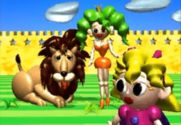
I have not found any information on what this is. Leave me a note if you know.
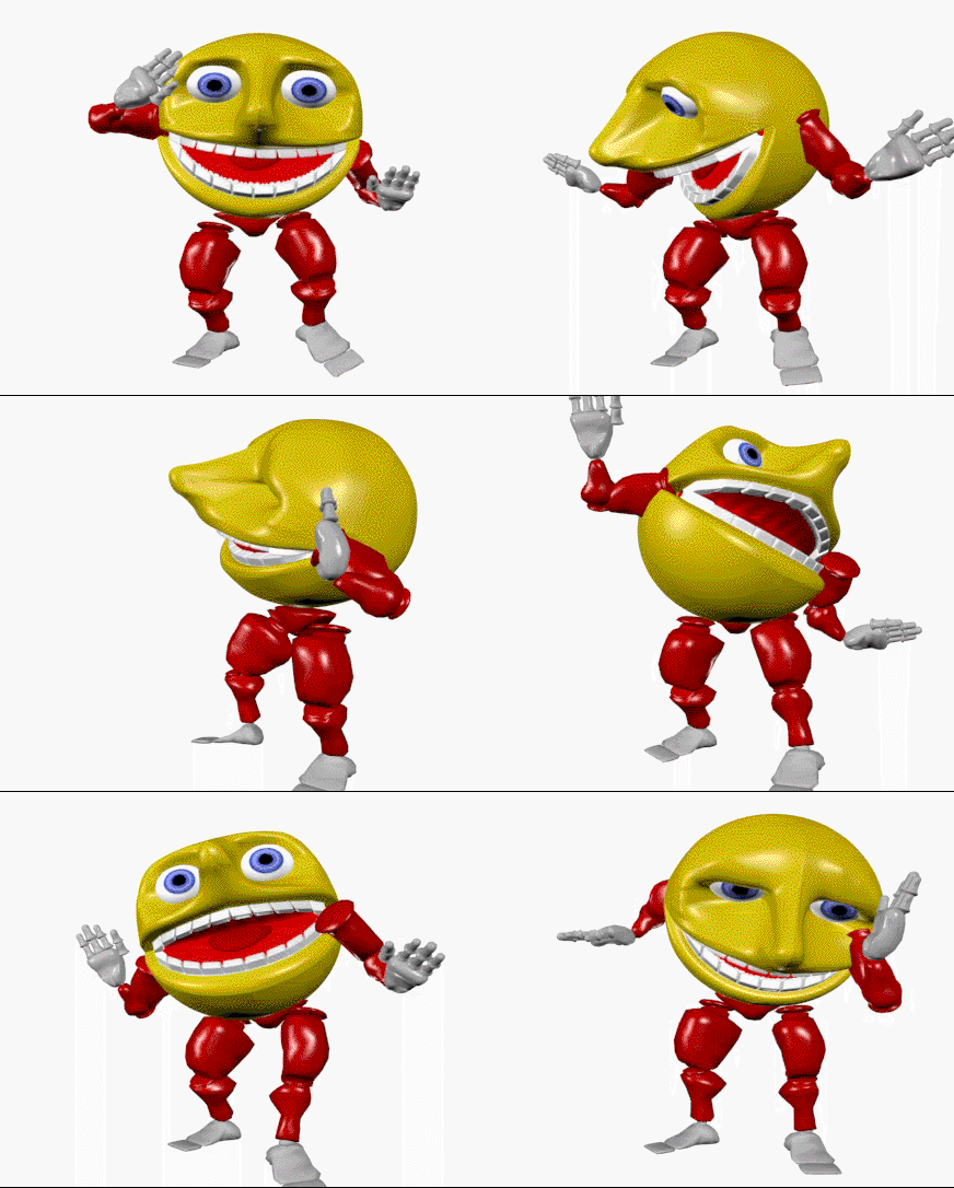
The teeth give it a certain similarity to the Baku Baku cover.

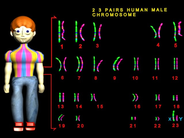
I have no idea what this is either, but somethin' ain't right with that boy's chromosomes.
Why couldn't they just have used some 2D clipart that wasn't terrifying?
I'm not sure what these are from, but clearly they are related characters, given the shoes and lop-sided eyes. The heart one dates back to at least 2005.
The software company Daz 3D has a free stock character called EmotiGuy (more commonly known as Picardia in the meme universe), who bears some similarities with the blue shoes. I'm not sure if they're related, though.


I've seen a bunch of meme captions featuring the one above with Russian text, suggesting the heart has destroyed its life and become addicted to the krokodil drug.

Someone made an even more unsettling version of the dentist gif using high-resolution realism-style graphics.
I found a similar character archived on a random GeoCities page in 2001.
Get it? It's a web surfer!

The following Tumblr page posted the websurfer, a floppy disk, and two gifs that may be unrelated (a fax machine and old telephone with no eyes).
https://oldwww.tumblr.com/post/685996098484158464

There is even a donut. I wonder how many more characters exist in this series. Maybe the designs aren't all that terrible.

Here's yet another weird creation. If my computer looked at me like that, I'd throw it out the window. (Ok, maybe that's a bit rude. Afterall, we are the ones who created him and made him like this.)
The oldest instance I could find is from 2008 and it appears on many Spanish-language websites. It's probably older.

I think the following is just a screenshot of the gif with a blush effect added by a random person, rather than a true variation of the gif.
Maybe I'm willing to be his friend and help him bring to justice the cruel person who forced him to exist like this. We are both victims of the Demiurge.
Now for something different. Here's a milk company mascot from Brazil.
Dollynho is the mascot of Dolly, a Brazilian beverage company.
[...]
On June 6th, 2013, one commercial featuring a character called "Barriguinha Mole" was posted on internet in a video called "A versão made in Acre do Dollynho," which translates to "Dollynho's version made in Acre."

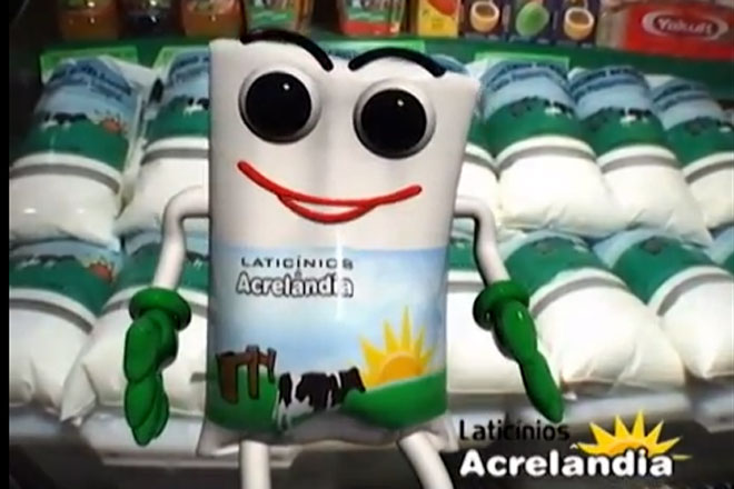
The way it moves in the commercial is absolutely terrifying. You have to watch for yourself.
Barriguinha Mole - A versão made in Acre do Dollynho
https://www.youtube.com/watch?v=-ApwxlX6ToE
The Dollynho mascot is really creepy as well, but it's like...ugly 2010s CGI instead of '90s.
Comercial - Dolly Com Dollynho (2009-2010-2011.) Original & Reverso/Ao Contrário.
https://www.youtube.com/watch?v=p1jehawr-Vw
Evil pill canister from a drug safety PSA by the organization safekids.org, produced in 2008 or prior.
https://www.youtube.com/watch?v=p7EQGROhCH0
This is the true peak form of late '00s CGI. The culmination of 30 years of work from the most brilliant minds of Western Civilization—a glossy pill bottle.
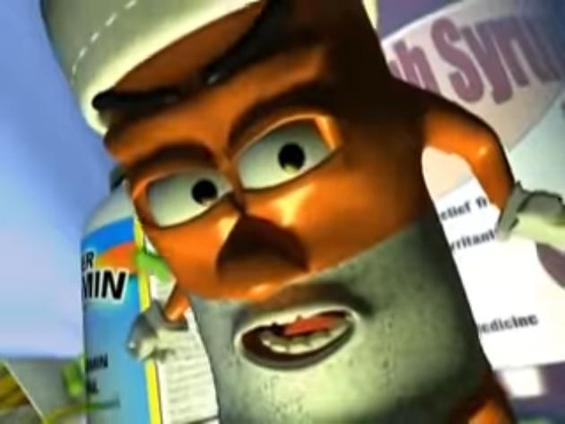

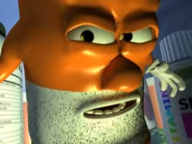
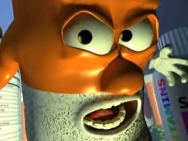

Someone decided to edit it into a music video for a Death Grips song. Certainly an improvement.
https://www.youtube.com/watch?v=AodBQ2ElXxs&list=PLCwSvGrJlsrLtB3sjCf2BpFdKSO7vdNFL&index=16
Let's shift gears and look at some music videos.
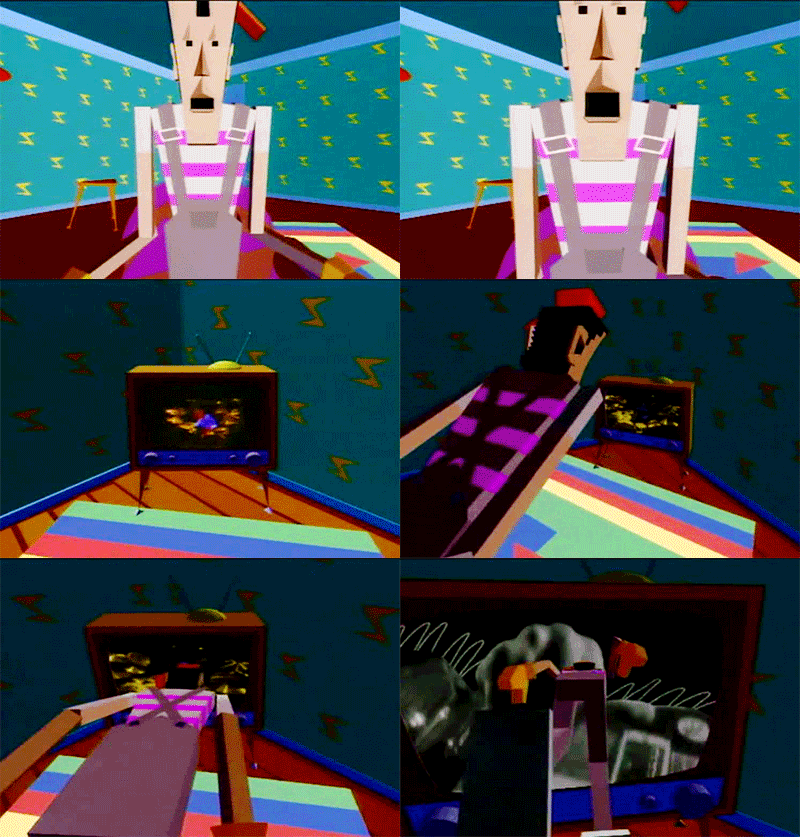
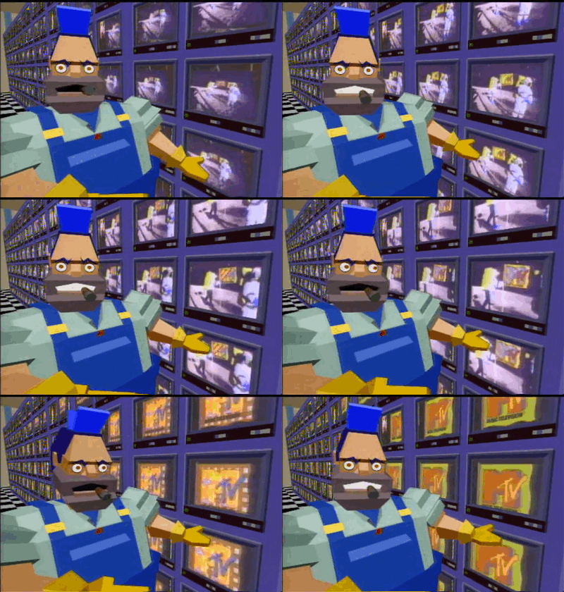
Dire Straits - Money for Nothing (1985)
https://www.youtube.com/watch?v=wTP2RUD_cL0
The coloring effects on the live portion of the music video are cool and very '80s. But that was not enough. The studio needed a cutting-edge music video.
Although I'll admit it is kind of cool how they were able to make the characters look so different despite the limited geometry.
Loco Loco is a Traditional Bubblegum dance artist from Norway. Loco Loco is three animated characters, two mosquitos and a large man. They are best known for their single “Mosquito”, which was released in 2006. Loco Loco released their debut album “Planet Loco” in 2006.
Loco Loco’s style is unique in that they use very high-pitched vocals. The “mosquitos” vocals are much more high-pitched than the vocals in typical bubblegum dance, and some critics have said that they can even become quite annoying, though fans of Loco Loco disagree, saying that the vocals are what makes Loco Loco so unique.
Supposedly this is for children.
LOCO LOCO - Mosquito (2006)
https://www.youtube.com/watch?v=_JzhQI168cM
Behold, the most highly evolved man and woman living above 55° North latitude:
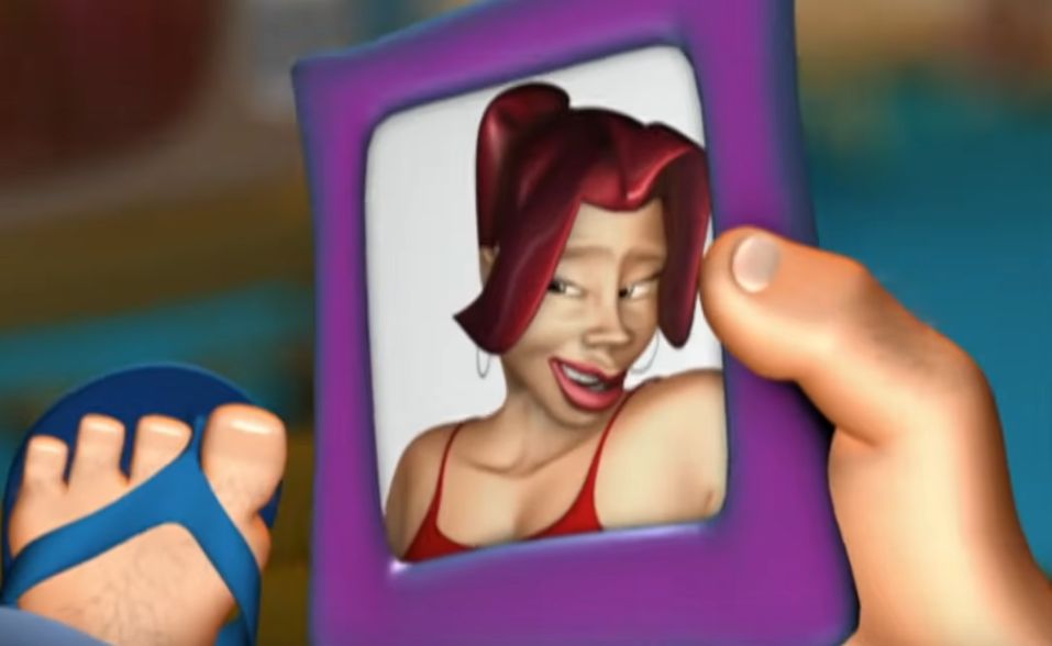
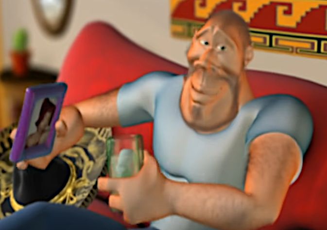
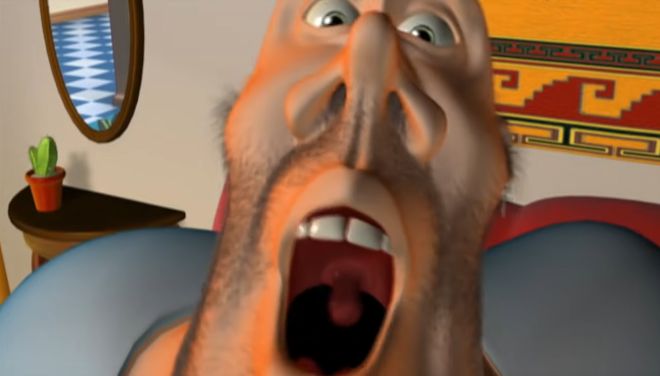
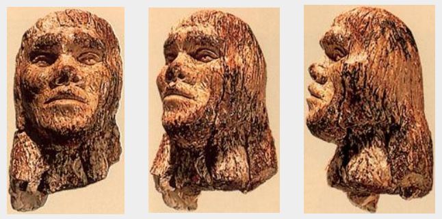
He looks remarkably like this (possibly forged) caveman carving from Dolni Vestonice.
LOCO LOCO - It Burns, Burns, Burns (2006)
https://www.youtube.com/watch?v=b6SaLAQ7gOo
This is the terrifying thumbnail on one of the Youtube uploads of this music video:

Unlike the other song, this one is bearable to listen to, but the music video manages to be more terrifying and filled with eye-rolling stereotype after stereotype.
However, I will concede that the bloke in the video does look like the type of person who imagines India to be nothing more than "haha hot curry." So, props on the design?

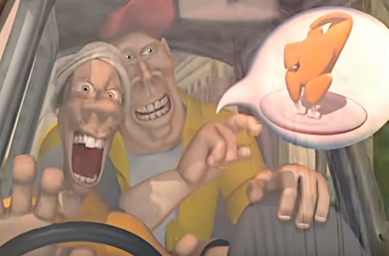
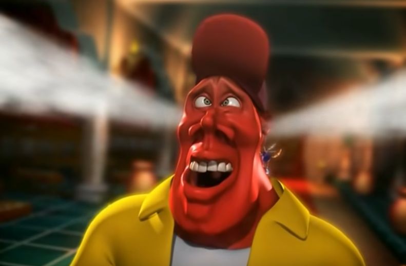
The Indian woman and mosquitos look "regular," so they definitely made the guy look terrifying on purpose.
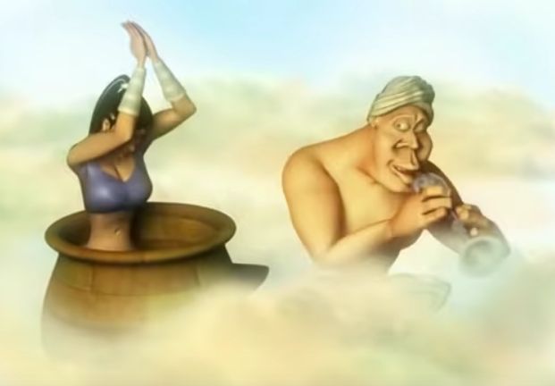
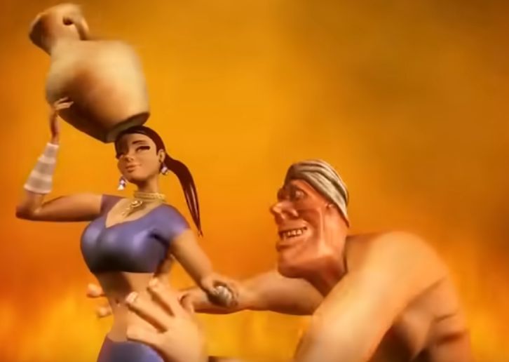
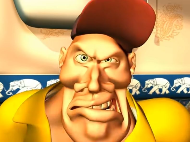
I found the following Youtube video about horrible CGI in music videos, and I'll repost most of the examples here.
Top 10 Music Videos with Cringe-Worthy CGI, by WatchMojo.com (June 8, 2016).
https://www.youtube.com/watch?v=bWD_Ft1pETY
Shanks and Bigfoot - Sweet Like Chocolate (1999)
https://www.youtube.com/watch?v=OQCQnARnKbc
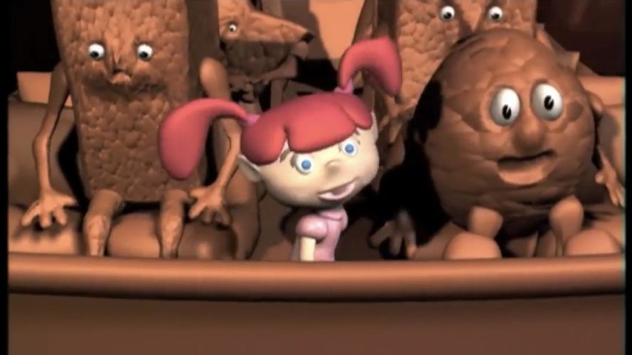
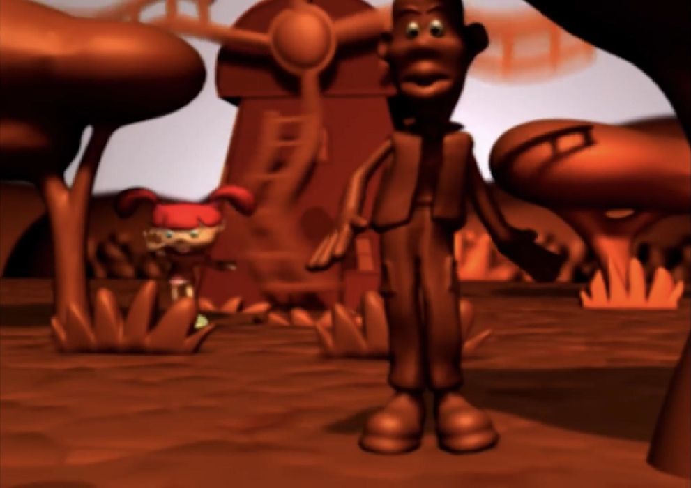
Spiderbait - Calypso (1996)
https://www.youtube.com/watch?v=tdXUipeWxy8


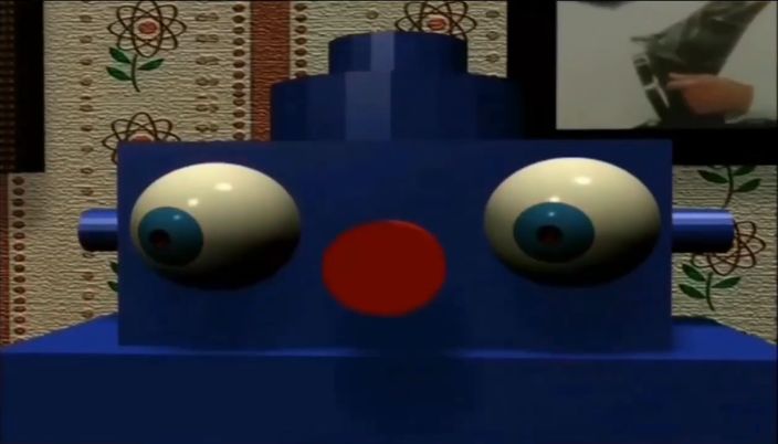
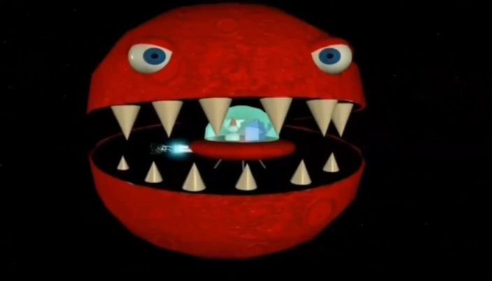
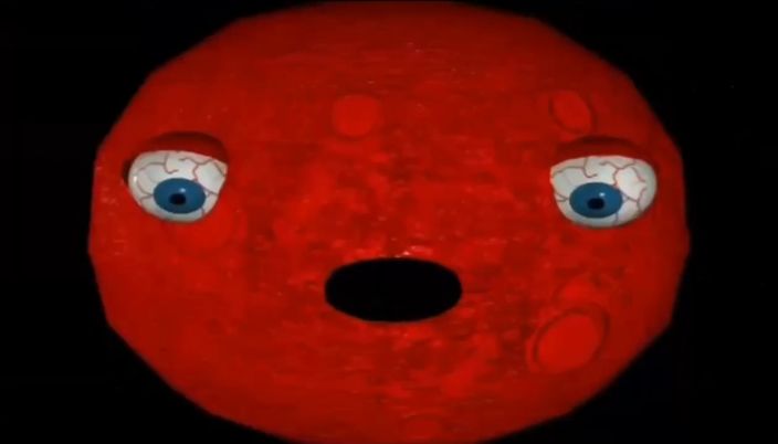
Def Leopard - Let's Get Rocked (1992)
https://www.youtube.com/watch?v=BO1Nae_EBvQ
The character is supposed to be a rebellious, badass, punk kid, but the video is just too ridiculously goofy-looking and clunkily-animated.
I'll let you watch it and refrain from posting something directly from the video, so as not to spoil it for you.
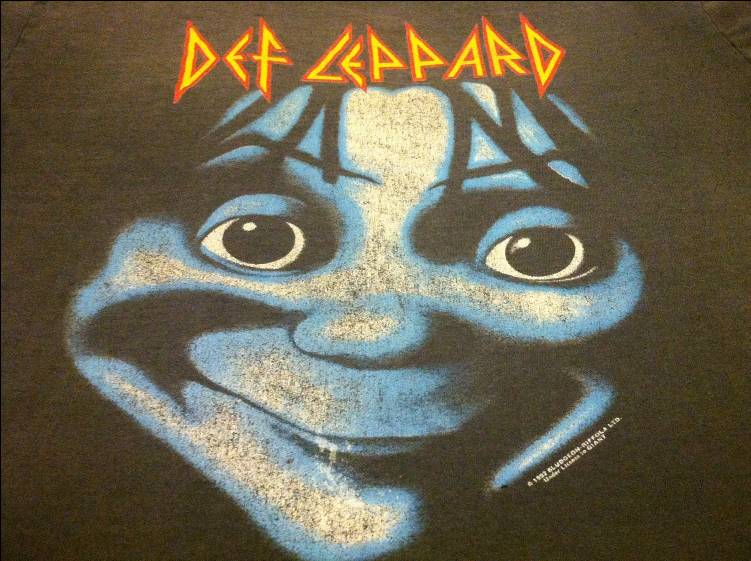
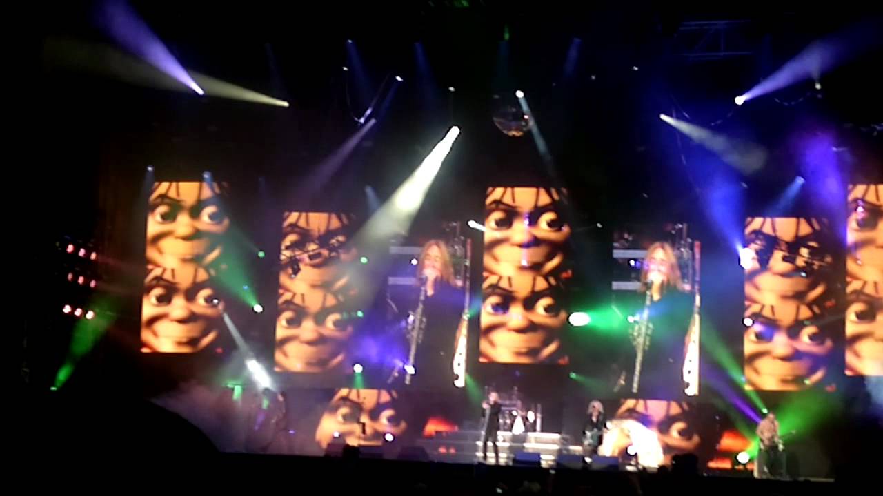
That would make a good emoji somewhere:
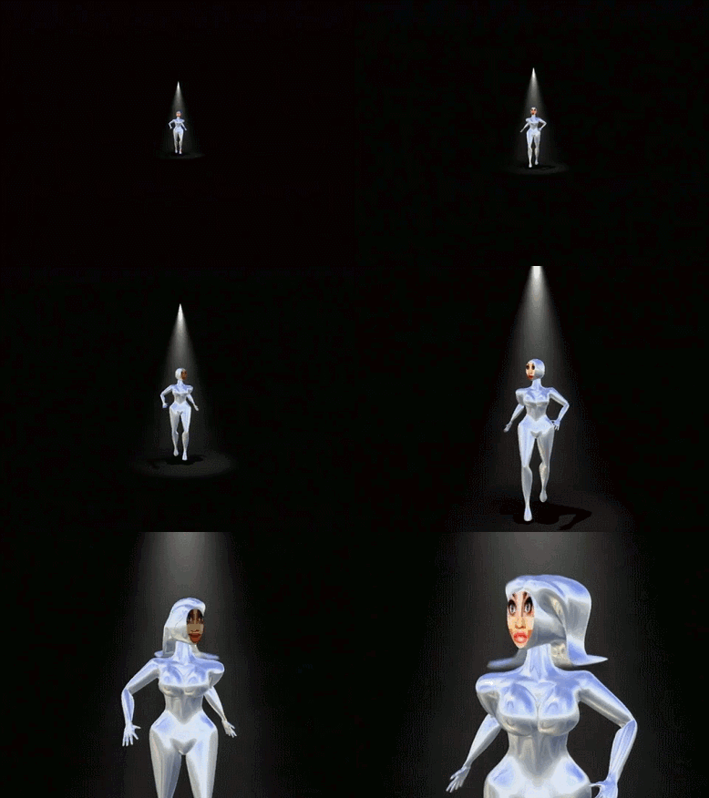
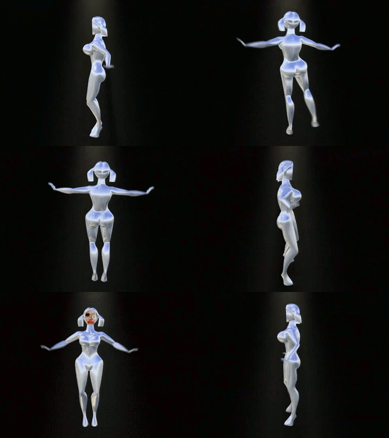
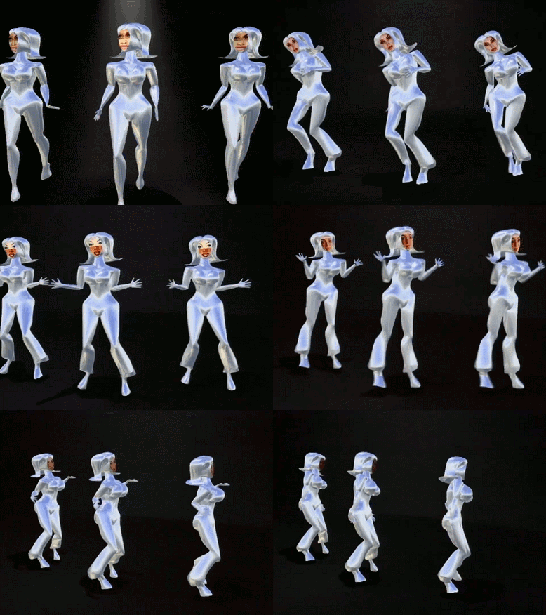
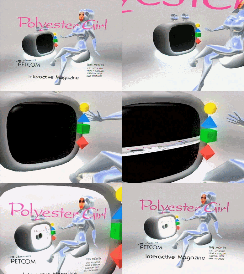
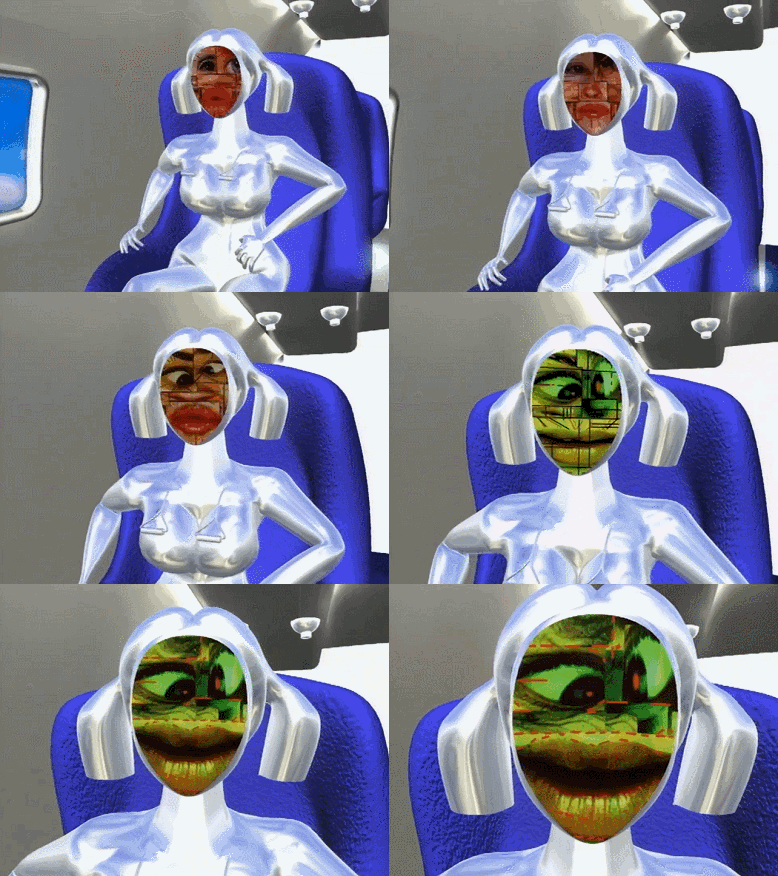
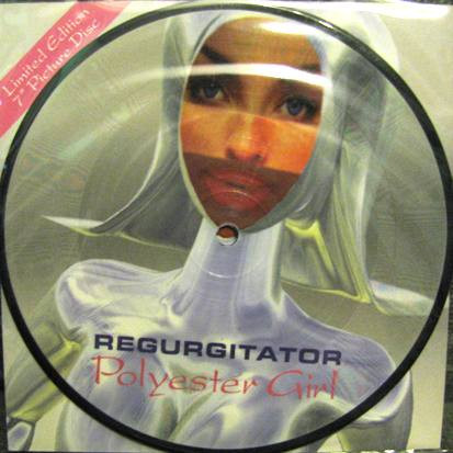
Regurgitator - Polyester Girl (1998)
https://www.youtube.com/watch?v=2BxVBziFvtU
Now we know what the Nicki Minaj and heavily-photoshopped "amateur Instagram model" looks are based on.

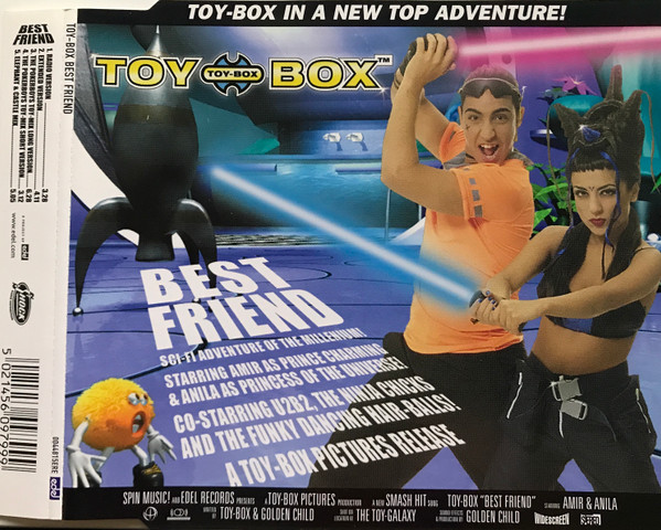
Toy-Box - Best Friend (1999)
https://www.youtube.com/watch?v=BddgVkX_e70
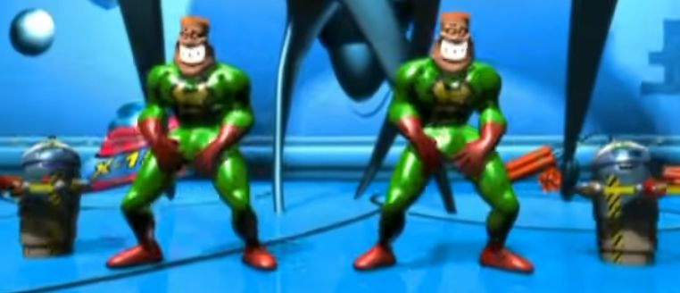
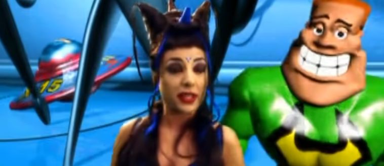

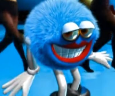
At least they had fun with it.
Eiffel 65 - Blue (Da Ba Dee) (1999)
https://www.youtube.com/watch?v=XgztfRBc2jM
These are the best gifs I could find, but the official music video itself isn't much higher resolution.
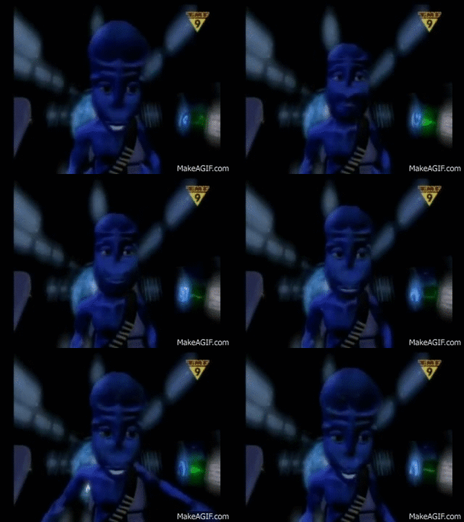
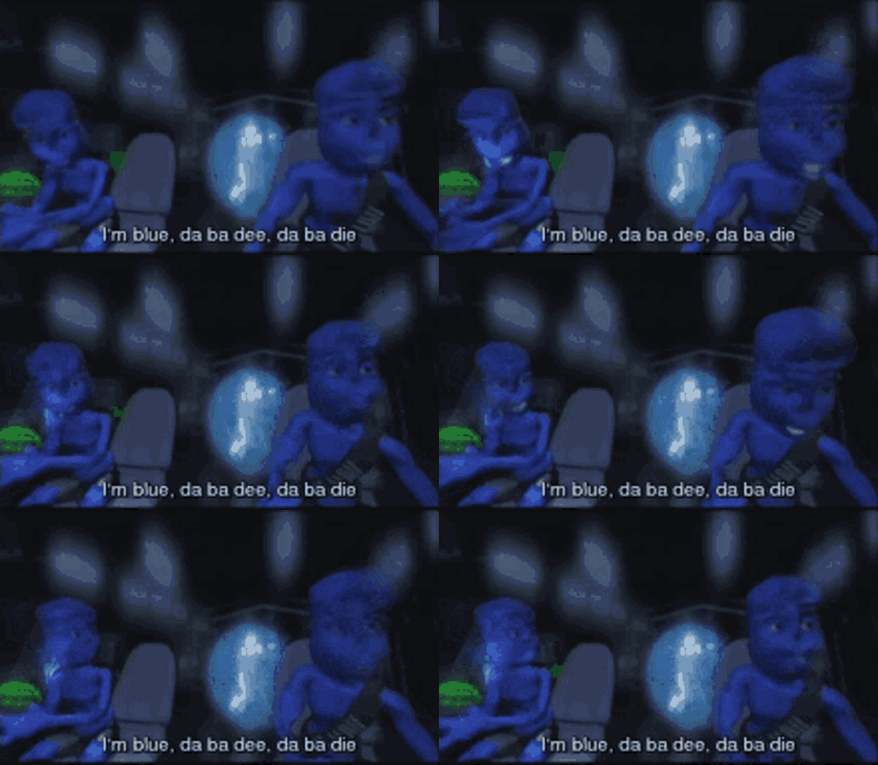
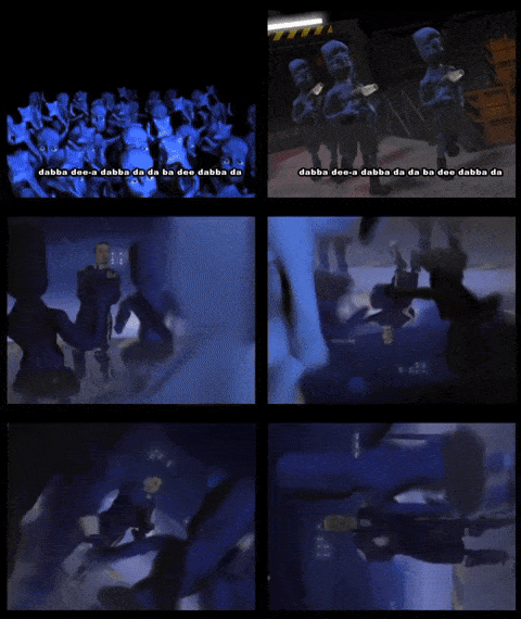
How small was their animation budget compared to their marketing budget? This song was everywhere back then!
Mortal Kombat: The Journey Begins (1995) is a 54-minute film with a strange mix of low-quality 2D and even-lower-quality 3D animation.
I won't post a screenshot since you'll think I'm just making it up.
Here is one of the many terrible 3D scenes:
https://www.youtube.com/watch?v=BiExlLCI710
(This is why early Street Fighter is better + it has Chun-Li.)
Apparently some people didn't get the memo that this "style" of design is an accursed plague upon the world, and they have kept using into the 2020s.
These are from the Swedish children's show Bilakuten. I can't find much info on it, but it existed since at least 2018 and is presumably ongoing. Bil akuten translates to "car emergency room."
The entire animation is pure nightmare fuel. The animators' oral fixation, the haphazard movement of the characters, and the fact that their pupils dilate at random as if they are hopping themselves up on every drug known to mankind makes this even more bizarre than Mr. Birk, quite frankly. The movement of the characters is so disorienting and the fact that the vehicles have regular child voices (instead of goofy cartoon voices like we may be used to hearing in English-language media) also makes it a bit more surreal.
The images alone are only 1/1000th of the creepiness.
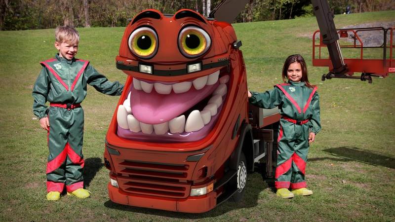
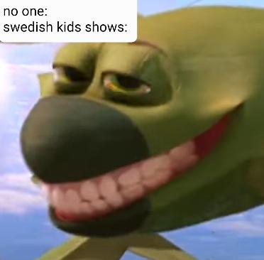
Feel free to traumatize yourself by watching a few clips. Words cannot describe what you are about to witness.
https://www.youtube.com/watch?v=_vxJ-I5_zQ0
https://www.youtube.com/watch?v=SFby17FuFAM
So many of the other examples on this page were terrifying due to the limits of animation and processing power at the time. But this... This looks like something a KGB agent would force someone to watch in order to torture them, rather than a kids' show.
Yet an other 2010s agony that should have never been created in light of decades of preceding horror is McDonald's sentient Happy Meal mascot.
This mascot, named "Happy", was introduced in France in 2009 (and the US in 2014). It will likely be a common memory brought up in therapy over the next few decades.
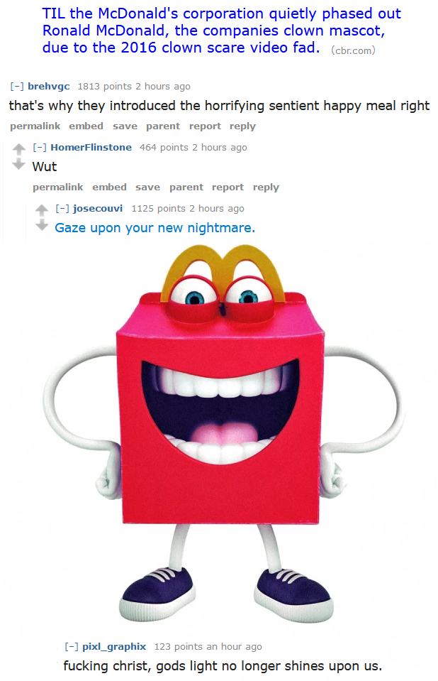
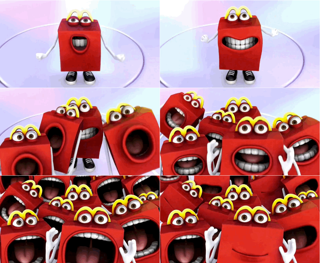

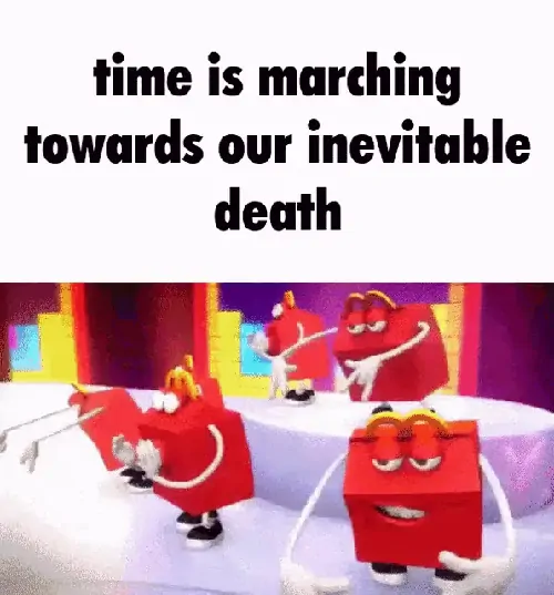
Happy and his cadre of companions were created by a Paris-based 3D print and animation film production company, Mecanique Generale. The anthropomorphic box is the brainchild of 3D director and illustrator Nicolas Lesaffre. On Lesaffre’s Linkedin page, he lists McDonald’s, among other top brands, as his clientele during his stint for the company.
Happy was first introduced by French McDonald’s outposts in 2009, where he was so well-received that the company instituted the mascot in Latin America and other European markets.
https://www.dailydot.com/business/mcdonalds-new-mascot-happy-racist/
Yet another reason France should not exist.
Oh yeah, the box is a little bit racist too.
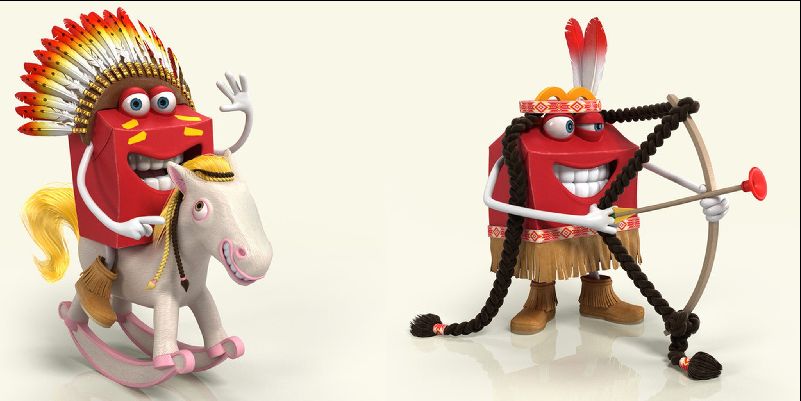
More examples of this horror:
https://knowyourmeme.com/memes/mcdonalds-happy-mascot
Part 2 - Retro-inspired designs made ugly on purpose
So, if something is made ugly on purpose, then it doesn't really count, since the creator knew it was an abomination. Nevertheless, I'll list some examples here anyway, to prove I'm not the only one who has observed this bizarre aesthetic.
I don't think meme encyclopedias are complete or very accurate sources, but it's a start I guess.
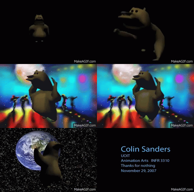
One of the first poorly made 3D animations was Colin's Bear Animation, an animation made by Colin Sanders for his final assignment for an Animation Arts class. It features a bear dancing to the song "Funky Monkey Dance" from the Nintendo game Mother 3. Sander's friend uploaded the video to Youtube in December 2007 and as of May 2014, it has over 2,250,000 views. The video was one of the first poorly made animations which was both surreal and considered humorous.
I imagine a lot of animation students over the past few decades have tried to mimic this style for certain projects.
Here are some other articles and videos discussing terrible old 3D design and the recent creations inspired by them.
Early CGI Was Horrifying, by KnowledgeHusk (April 7, 2022).
https://www.youtube.com/watch?v=XyGfxCxnZW0
Luke Winkie. (Published September 2, 2015, updated May 28, 2021). YouTube has rediscovered early 3D animation—and it’s horrifying. DailyDot.
https://www.dailydot.com/unclick/the-horror-of-early-3d-animation/
Here are some other resources, which may or may not feature fear-inducing designs.
"r/RetroCGI is for creating and sharing new art inspired by vintage CGI from the 1970s to the early 2000s, using either tools from the time period or modern tools. For actual vintage CGI please visit r/VintageCGI."
https://old.reddit.com/r/retrocgi/
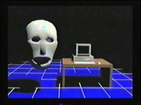
I actually like this one, because the voice, music, and imagery are all so surreal.
These videos were made in the 2010s, but were apparently made on 1990s computers and software.
They perfectly walk that fine line between sincerity and satire.
The Computer, by Nicholas Fedorov (July 25th, 2015). (Reuploaded by Joe Johnson, December 29, 2017).
https://www.youtube.com/watch?v=_ejlunb-aPA
https://archive.org/details/NicholasFedorovTHECOMPUTEROfficialVideo
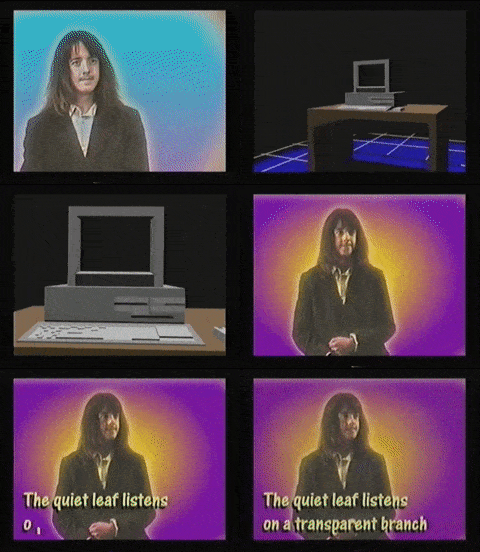
He has garnered something of a fandom it seems, despite apparently moving on from video making.
https://knowyourmeme.com/memes/people/nicholas-fedorov
https://youtube.fandom.com/wiki/Nicholas_Fedorov
https://old.reddit.com/r/nicholasfedorov/
Here's a 12 minute compilation of some of Fedorov's work (including a film about a vampire who has not paid his taxes), with a janky VHS filter that I presume wasn't in the original animations.
https://www.youtube.com/watch?v=QzmBjsVYID0
Know Your Meme mentions "Colin's Bear Animation" as one of the earliest examples of "intentionally-bad CGI".
Colin's Bear Animation, uploaded to Youtube by atticusbird182 (December 3, 2007). Animation by Colin Sanders (November 29, 2007).
https://www.youtube.com/watch?v=FiARsQSlzDc
Here are a few animations from 2006 (or, at least that's when they were uploaded to Youtube). I think these videos and the other animations on the channel raise an existential question. While they are certainly weird-looking on purpose, is it a parody of the "bad CGI" aesthetic, or is it weird-looking because it is an authentic example of of bad '00s CGI?
For example, a low-effort 2D animation made by one person is going to be "ugly" (perhaps intentionally so for comedic purposes), but that doesn't necessarily mean it's parodying any style.
Was the animator self-aware of the then-emerging aesthetic shift in CGI design, or is the design simply an earnest reflection of what a quick-and-dirty 3D Studio Max hobbyist animation of the mid-'00s looked like?
The same question can be posed for Colin's Bear Animation.
The Pill, by Roy Lazarovich (April 24, 2006).
https://www.youtube.com/watch?v=A7HKejQXljo
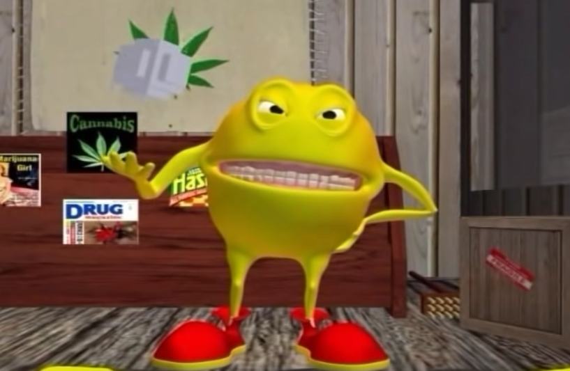
Jibristan, by Roy Lazarovich (April 24, 2006).
https://www.youtube.com/watch?v=1o0NF-ubT-c
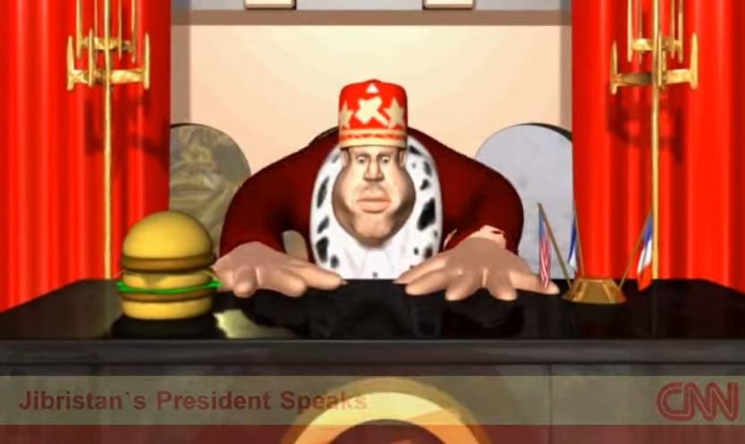
Here is another intentionally-horrifying animation project: Uncle Samsonite. Be sure to watch it with sound—that's half of the unsettlingness.
Intro to 3D Animation Final Project, by Jake Bowen (September 14, 2014).
https://www.youtube.com/watch?v=py_jyGBr71w

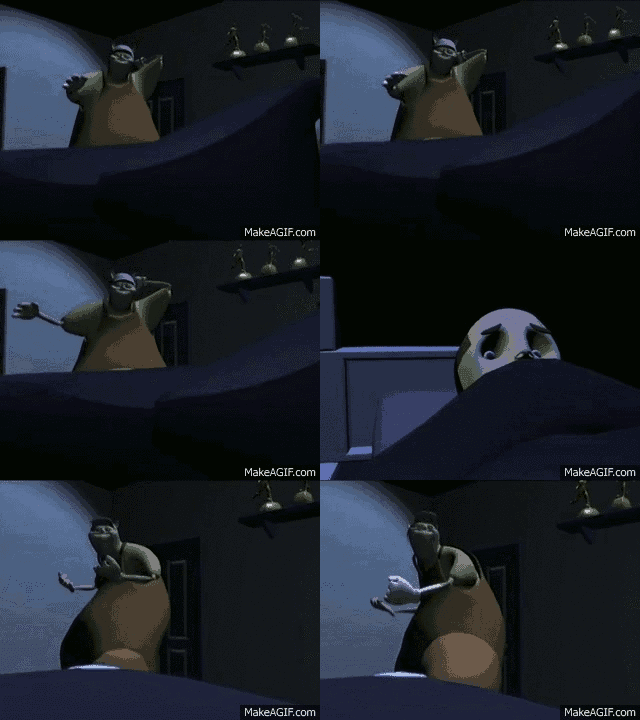
Have you heard of Ratboy Genius? Now you have.
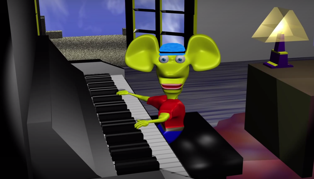
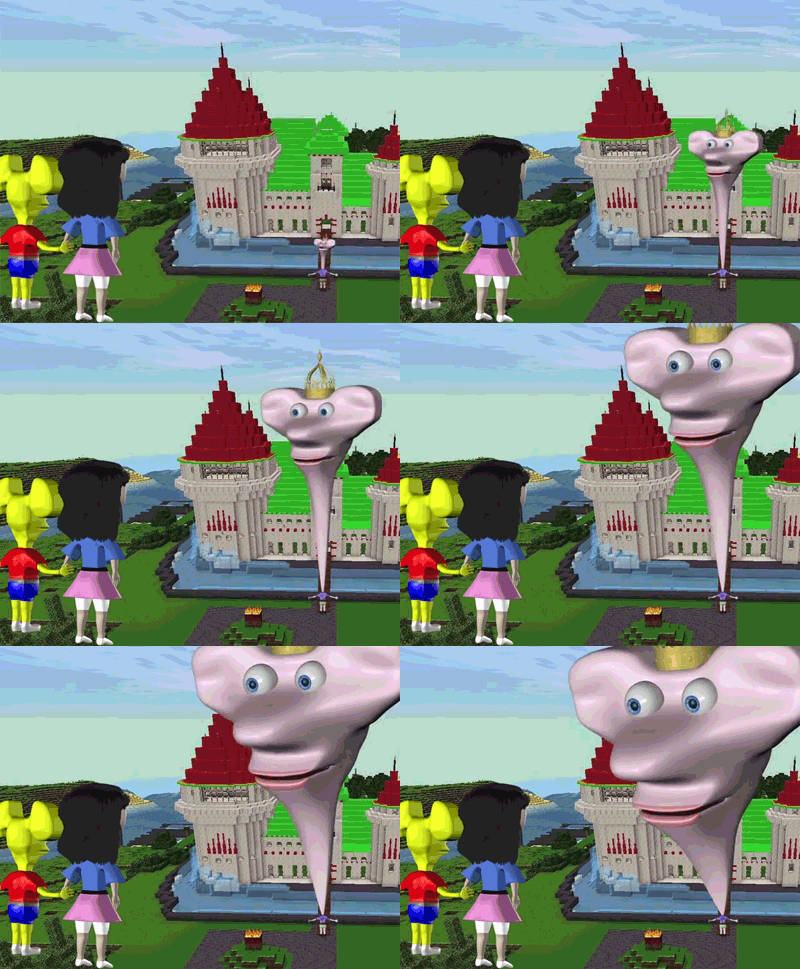
Here's the most popular Ratboy Genius clip:
Potato Knishes OFFICIAL, by ratboygenius (May 13, 2013).
https://www.youtube.com/watch?v=IFfLCuHSZ-U
https://www.youtube.com/c/ratboygenius
I'll let you dig into that rabbit hole. It seems it began as 3D animation in 2007, and the creator has a PhD in music composition.
https://knowyourmeme.com/memes/ratboy-genius
https://old.reddit.com/r/ratboygenius/
https://ratboygenius.fandom.com/wiki/Ratboy_Genius
https://tvtropes.org/pmwiki/pmwiki.php/WebAnimation/RatboyGenius
RX - Bumble: Nightshifters (2010).
This is a music video featuring some wonky animation with a '90s 3D aesthetic.
Some of the particular segments have become memes in gif form.
https://knowyourmeme.com/memes/rx-bumble
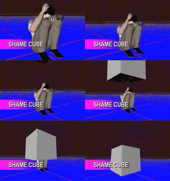
Baldi's Basics is a horror maze-escape type game released in 2018. The game is very much a parody of '90s 3D graphics and video games.

What Happened To Baldi's Basics? (2018-2021 Documentary), by Sheeprampage (March 28, 2021).
https://www.youtube.com/watch?v=WRVOg-haljg
Baldi's Basics FULL GAME, by Markiplier (May 28, 2018).
https://www.youtube.com/watch?v=aVWOcEptfO8

Got More?
Leave me a note if you know of other examples.
We must showcase these abominations so the world never repeats the same mistakes, and so we never forget that 3D graphics are not inherently an improvement or replacement for 2D animation.

